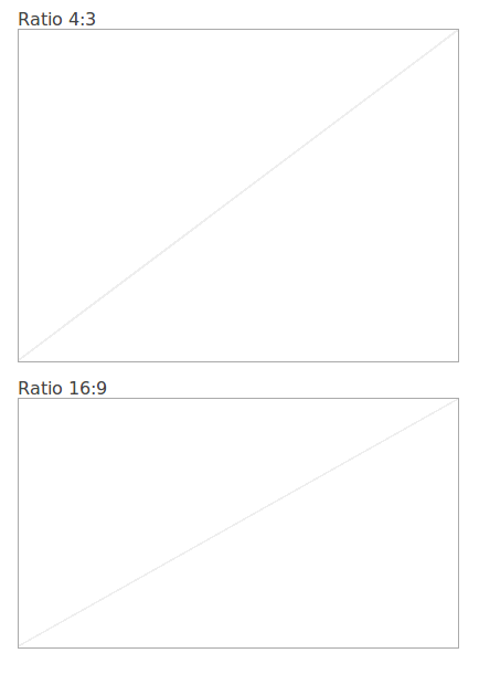
Prototype UI With CSS Placeholder Blocks
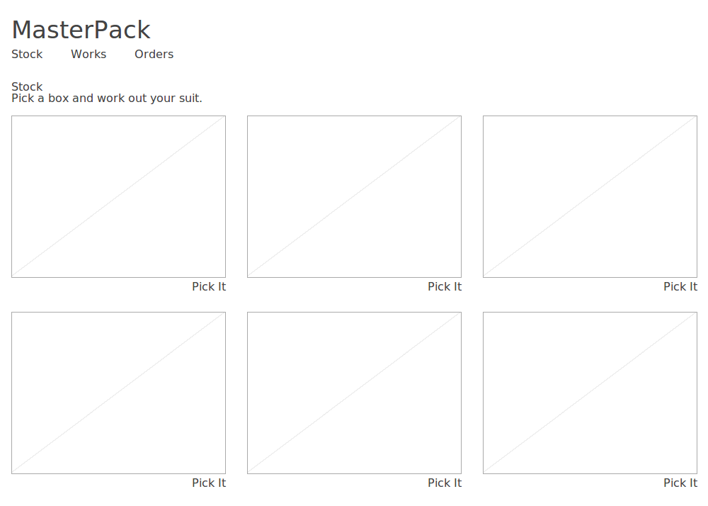
Sometime I prototype UI for like illustrating a new workflow on an existing website. I would prefer coding rather than launching mockup tools like sketch. When placing images on a particular ratio, usually we leverage placeholder services like placekitten. But here I will introduce my way, adding a responsive placeholder block with constrainted ratio, leveraging scss.

Usage

1
2
3
4
5
<!-- generate a 4:3 placeholder block -->
<div class="_i4_3"></div>

<!-- similar for 16:9 -->
<div class="_i16_9"></div>

The scss

1
2
3
4
5
6
7
8
9
10
11
12
13
14
15
16
17
18
19
20
21
22
// add a diagonal line to our placeholder block
[class^="_i"] {
  border: 1px solid #aaa;
  background:
     linear-gradient(to top left,
         white 0%,
         white 49.9%,
         #eee 50%,
         white 50.4%,
         white 100%
         );
}

// generate classes for having responsive height
@each $i in 3, 4, 5, 12, 16 {
  @for $k from 1 through $i {
    ._i#{$i}_#{$k} {
      height: 0;
      padding-bottom: percentage($k/$i);
    }
  }
}